New Combat Screen Layout!

Residents of glorious Tartu!


Our Game Interface has undergone some small, but very useful changes! 


• Combat spells can now be seen either in the Spellbook, either in the battle.
• Three "striking" spells during the battle are now located to the left of the physical attacks, and three "DOT" spells - on the right. 


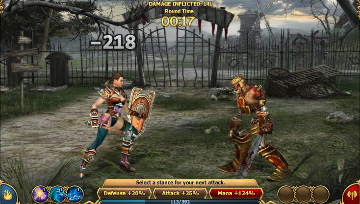
• The stands you and your opponent have selected for the battle, protective, magical or attacking, are now displayed as icons in the lower corners of the combat screen.

Comments
gettin better :-)
Really like the stance identifiers on the screen. I feel the spell icons could be a little bigger, but nice overall update to interface.
This news is kinda late isn't it
the changes has been occurred for 2 days.
got confused when this new interface applied, I thought I broke my amulet or something.
anyway, it is useful, it makes skill tactic become easier, good job guys ">
I agree - looks better - perhaps we could have a choice of warrior faces / hair / skin colour next?
Luthien x
These new interfaces are really great. I am enjoying the game so far, the tutorial was very good. I also asked about character customisation in the forums a little while ago. Hope that can happen perhaps.
I like it
I like the fact that the new interface frees up space on the item bar area. One criticism would be to make the icons a tad bit bigger, along with the "clickable" area on the icon to activate the spell. I find it very difficult at time to get the mouse in just the right spot to click the spell.

Also, I like the icons that are now shown to indicate the combat stance... very good.
it'll take time to get used to though, Other than that excellent
I have problems clicking the spells. often times I click and it not be used and sometimes my timer runs out before I can use it again. but overall decent update
Im glad, i thought i broke my game! JK I got it quick, now im used to it!
i love the new layout so much easier to use when imon my laptop
its looks better but dosnt do anything for gameplay. iv always been in favor of gameplay/storyline over graphics.
good update, like it, keep up the good works admins ^^
Love the update, looks alot better
This woulda been great if we'd had a heads up...as it was, i died in a simple battle because this happened w/o warning and i lagged for about 10 minutes straight, even while attempting a refresh. killing me...literally!
I like the change, but I am having a hard time making sure that my spell works for me now because I'll click on it and it won't work for me. If the circles could be just a little bigger, I think it would make a difference :D
Have to agree, the icons and the click-able area need to be increased by at least ten to twenty percent.
the icons need sorting out, if you dont hit them right they have to be hit again.. but apart from that i like it :D
Now that I got more slots for belt and effect slots, it makes fighting easier....good update....hope to see more update comes more quickly but not at expense of more bugs.
Simple but useful update that improves gaming experience.....every little bit of improvement adds up
You need to log in or register before leaving a comment.