OPTIMUS PRlME8
Making Clan-News to look better (HTML - CSS tutorial for noobs)
2020 note: Now I don't agree with some details in this topic (and how it was written in general), but this isn't a professional markup lesson, and is still 'edible' for simple styling.
- Foreword -
Nearly everything, what you have seen in my guides - can be repeated in your clan-news. I'm not a pro web-designer 80 lvl, but already know something and can share my knowledge with you. Here is tutorial about how it works. I've tried to gather here everything most useful exactly for drago forum formatting. It may seem too complex, but it isn't, if you are really interested. You just need time, experimental topic in clan-news and a cup of coffee (codes don't work without coffee!).
You also can experiment here: JsFiddle, Liveweave or Codepen
If you have made a mistake in the topic and broke everything - it always can be fixed from the outside. And don't expect, that you will understand and remember everything from the first 'run'. Let the experience to do his work)
You are already familiar with base codes on this forum:
b (bold) =>
<b> T E X T </b>
u (underline) =>
<u> T E X T </u>
i (italic) =>
<i> T E X T </i>
Combined =>
<i><b><u> T E X T <u><b></i>
These are basic codes of the language, named HTML - HyperText Markup Language. With codes of this language you can place images, change the text size, color, make tables, etc. It's only about styling, no mouse over / click effects or animation.
<img src="your-image.png" >
Src means source. There can be adress of .png / .jpg / .svg / .gif / etc images.
<img src="http://dragoneternity.com/game/shared/data/itemTpls_picture/shar-kostoloma-81.png">
→ 
To get an image link faster, you can right-click on image and in the opened menu, choose "Copy image address" or "Copy image url". It doesn't work everywhere, but mostly does.
(i) gyazo.com - a comfortable program for making screens (when you get a link, just add .png to it).
If you already have a saved image, it can be uploaded to imgur.com/upload
So, we have a displayed image, but it looks bad in the text, with huge spaces.
style="property: value;"
To display our image in the text, we need to add some style, like this:
<img src="..." style="float: left;" >
<img src="..." style="float: right;" >
oppa gangnam style, op, op... gangnam style. oppa gangnam style, op, op, op... gangnam style. oppa gangnam style, op, op... gangnam style. oppa gangnam style, op, op... gangnam style.Another problem. Text is sticking to the image. We need to add some free field. Margin will help.
<img src="..." style="float: left; margin-right: 10px" >
Here could be another text, but... Suffer, oppa gangnam style, op, op... gangnam style. oppa gangnam style, op, op, op... gangnam style. oppa gangnam style, op, op... gangnam style. oppa gangnam style, op, op... gangnam style.(px = pixel)
Multiple margins can be combined:
style="margin-top: 10px; margin-right: 20px; margin-bottom: 30px; margin-left: 40px;"
OR
style="margin: 10px 20px 30px 40px;
Remember, by the direction of clock-arrows, margin: top right bottom left;
If you have a constant margin in all directions, just write
margin: 10px;
All item-images have 60 pixel width and height, but you can change them, if necessary:
<img src="..." style="width: 50px;">
→ height: 50px; also could be set, but usually it adjusts to the width, saving proportions.
If you want to center the image, remove everything and put it inside the <center> tag (deprecated, but works):
<center> <img src="..." > </center>
Correct ways to center the image:
• style="margin: auto; display: block;"
• <div style="text-align: center"> <img src="..."> </div>
<a href="Any_Adress"> Text of the link </a>
a = anchor
href = hypertext reference
A simple link (don't click):
<a href="http://dragoneternity.com/forum/forum_library/">Game guides</a>
→ Game guides When you click such links, the current page reloads to the linked page. It's not so comfortable, if there is another information in the current page, that will be useful. When user clicks the link with pressed 'CTRL' key, it always opens in a new tab. But everyone don't know this. If you are creator of the link, it's good to make it open in a new tab:
<a target="_blank" href="http://dragoneternity.com/forum/forum_library/">Game guides</a>
It will make this link → Game guides (try to click). Target attribute helps to tell the link where to open.
The link text can be modified, for example, with b or u tags:
<a target="_blank" href="..."><b><u>Game guides</u></b></a>
→ Game guidesIt also can be colored (will see below).
How to show ITEMs (combination of <a> and <img>)
Let's open info of a random item →
 Now we have his image link and can make an image:
<img src="http://dragoneternity.com/game/
shared/data/itemTpls_picture/
prof_production_plant18_rd.png?ux=1325009479">
shared/data/itemTpls_picture/
prof_production_plant18_rd.png?ux=1325009479">
↓

But all items in our forum have a golden border. We could figure out his colors and make a border, but it has own 'name' in the forum, which can be added to a code. His name is gold-frame. It's not a unique code and works only in our forum.
<img class="gold-frame" src="...">
→ Now we have an image, which can be used with link:
<a target="_blank" href="http://dragoneternity.com/entity/item/28696.html" ><img src="http://dragoneternity.com/game/shared/data/itemTpls_picture/prof_production_plant18_rd.png?ux=1325009479" class="gold-frame"><a>
To add a pop-up description, we also have a code, that works only in the drago forum. It's a JavaScript function and you don't need to understand it, just remember: onmouseover="itemHint(this, 28696);"
<a onmouseover="itemHint(this, 28696);" target="_blank" href="http://dragoneternity.com/entity/item/28696.html" ><img src="http://dragoneternity.com/game/shared/data/itemTpls_picture/prof_production_plant18_rd.png?ux=1325009479" class="gold-frame"><a>
This code already gives a complete item with link and description:
If you need to display some quantity, remember this classes:
<a class="obj" onmouseover="itemHint(this, 28696);" target="_blank" href="http://dragoneternity.com/entity/item/28696.html" ><img src="http://dragoneternity.com/game/shared/data/itemTpls_picture/prof_production_plant18_rd.png?ux=1325009479" class="gold-frame"><span class="qty">150</span></a>
150Also, you can replace his image with the text, if you need to link an item with changed title:
<a onmouseover="itemHint(this, 28696);" target="_blank" href="http://dragoneternity.com/entity/item/28696.html" ><b><class name='itemType6'>Many-many Plums</class></b><a>
Many-many Plums.
Here I used a ready color code of our forum, but there are another ways to change the color.

HTML colors at all
To learn, how to change a color of something, at first we must figure out, how do colors work here.
There are many key words as color: red; or color: green; or color: black; etc., but all this names give an exact colors, which are not so useful. More often you have to pick an exact shade, that seems to look better.
At W3schools site you can find this color picker (don't panic!):
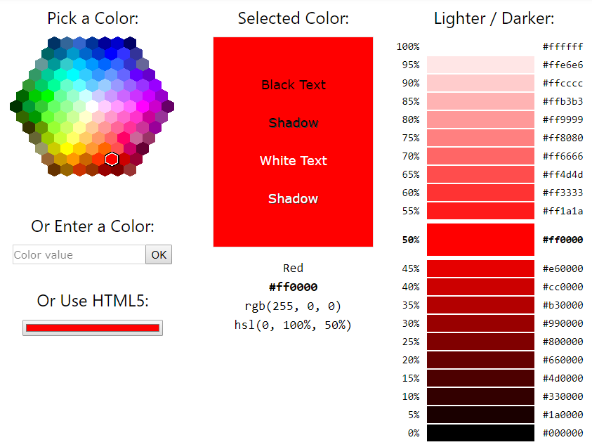
At first, attention to the central text rgb(255, 0, 0)
RGB means Red Green Blue, and the thing is - that all colors can be presented by the combination of Red, Green and Blue colors. Each pixel on your display consists from the mini-RGB lights.
If they dont glow (0, 0, 0) - you see the black color.
If all of them glow with their maximum (255, 255, 255) - you will see the white color.
RGB(255, 0, 0) - maximum red and none green and blue. This code will give this color.
RGB(0, 255, 0) - This green (bad... bad green!)
RGB(0, 0, 255) - This blue (Not so good blue!)
So, we can play with this numbers (for example, Here) and get a huge choise of colors.
RGB(128, 0, 0), RGB(240, 120, 0), RGB(20, 60, 120), RGB(0, 100, 0), RGB(200, 0, 160)
If you wonder, how it works... I can't explain it better, than Vsauce - Michael here.
If you met a cool color somewhere, press Print Screen (PrntScr) button on your keyboard, open the 'Paint' program ant press [CTRL + V]. And usually I use the Paint edit-color tool, to choose a good color, but W3-colors also will be helpful for understanding, how it works,

As you can see, forum's usual color is rgb(255, 222, 159);
Besides the RGB colors, also exist another color systems.
Hexadecimal numeral system uses 16 symbols to count, instead of usual 10 of the decimal (don't panic!).
Usually we count like this:
| 0, | 1, | 2, | 3, | 4, | 5, | 6, | 7, | 8, | 9, | 10, | 11, | 12, | 13, | 14, | 15, | 16, | 17, | 18, | 19, | etc... |
But in Hex system, it looks like...
| 0, | 1, | 2, | 3, | 4, | 5, | 6, | 7, | 8, | 9, | a, | b, | c, | d, | e, | f, | |
| 10, | 11, | 12, | 13, | 14, | 15 | 16, | 17, | 18, | 19, | 1a, | 1b, | 1c, | 1d, | 1e, | 1f, | |
| 20, | 21, | 22, | 23, | 24, | 25 | 26, | 27, | 28, | 29, | 2a, | 2b, | twenty-c etc. | ||||
As you can see, in Hex system, 15th number is f /// 16 = Hex 10 /// 17 = Hex 11 /// 18 = Hex 12 /// ...
.../// 26 = Hex 1a /// 27 = Hex 1b etc. If you keep counting, 255 will be equal to Hex FF
We don't have to operate with numbers, higher than 255, so you don't need to remember a complex formula of Dec → Hex numbers transformation. Just take any number from RGB and divide it by 16.
255 / 16 = 15 integer + 15 residual number. As you remember, dec 15 equals to hex F
So, Dec 255 = Hex FF
Why am I writing this?
Because RGB(255,255,255) and #FFFFFF is the same thing. And sometimes it's easier to remember (and write) a Hex-number, than RGB.
Second thing, if you have a Hex color like #FF55DD, it can be abbreviated to #F5D
So, if you need a white color, it's faster to type color: #fff; than color: rgb(255, 255, 255);
Other examples:
RGB(200,100,0)
200 / 16 = 12 integer + 8 residual = C8
100 / 16 = 6 int + 4 res = 64
0 = 00
RGB(200,100,0) = #C86400
____________________
#045ACF (it's our game item's blue)
04 = 0x16 + 4 = 4
5A = 5x16 + 10 = 90
CF = 12x16 + 15 = 207
#045ACF = RGB(4, 90, 207)
(!) Letter cases doesn't matter. #FFF = #fff //// RGB(0,0,0) = rgb(0,0,0) = rgb(0, 0, 0)
style="color: rgb(0, 0, 0); background-color: rgb(0, 0, 0);"
Let's return to the links and add colors to them.
<a style="color: #cc0000;" target="_blank" href="...">Game guides</a>
<a style="color: #fff; background-color: #c00" target="_blank" href="...">Game guides</a>
First link: Game guides, second link: Game guides
Color and Background-color can be applied not only to links, but everywhere, where color can be changed.
<span style="color: ...; font-family: '...';"> Text </span>
Span is inline element and used to change the text's color, background or something else.
<span style="color: red;">Text</span>
→ Text<span style="font-size: 50px; color: red;">Text</span>
→ TextAlso you can change fonts:
<span style="font-family: 'Monotype Corsiva';">Text</span>
→ Text<span style="font-family: 'Comic Sans ms';">Text</span>
→ Text<span style="font-family: 'Impact';">Text</span>
→ Text<span style="font-family: 'Times New Roman';">Text</span>
→ Text<span style="font-family: 'Courier New';">Text</span>
→ Text<span style="font-family: 'Calibri';">Text</span>
→ TextContainers <div> here can be everything </div>
div = division
For example, orange bordered boxes in this topic were made with divs.
<div style="display: inline-block; background-color: #fff1ba; padding: 3px 5px 3px 5px; border: 1px solid rgb(240,150,20); box-shadow: 0 0 0 1px white, 0 0 0 3px rgb(240,150,20); margin: 0 5px 0 5px; cursor: pointer;"> smth here </div>
Let's write it in another way...
<div style="
? display: inline-block;
background-color: #fff1ba;
? padding: 3px 5px 3px 5px;
? border: 1px solid rgb(240,150,20);
? box-shadow: 0 0 0 1px white, 0 0 0 3px rgb(240,150,20);
margin: 0 5px 0 5px;
? cursor: pointer;
"> smth here </div>
? display: inline-block;
background-color: #fff1ba;
? padding: 3px 5px 3px 5px;
? border: 1px solid rgb(240,150,20);
? box-shadow: 0 0 0 1px white, 0 0 0 3px rgb(240,150,20);
margin: 0 5px 0 5px;
? cursor: pointer;
"> smth here </div>
And try to explain each '?'.
border: 1px solid rgb(240,150,20);
Not only div can have a border, but many other elements.
Instead of
border-width: 1px; border-style: solid; border-color: rgb(240,150,20);
I just used combined version
border: 1px solid rgb(240,150,20); - it's inner thin border
You can't make different double borders with border. Here I used shadows for double border (see later).
Border-style also can be:
border: 3px dashed red;
border: 3px dotted red;
border: 3px double red;
Double border must have at least 3px width, otherwise it will not work.
Also you can set own border for each side:
<div style="border-left: 120px solid orange; border-top: 2px dashed red; border-bottom: 2px dashed red; border-right: 2px solid #045acf; width: 700px; height: 50px;"> </div>
border-radius: _ ;
Look at examples:
1. div style="width: 80px; height: 80px; border: 2px solid red;"
2. div style="width: 80px; height: 80px; border: 2px solid red; border-radius: 50%"
3. div style="width: 80px; height: 80px; border: 20px solid red; border-radius: 50%"
4. div style="width: 0px; height: 0px; border: 40px solid red; border-radius: 50%"
1 234
If you have a square, radius: 50% gives a circle each time. You could also write border-radius: 40px;
Circle divs are not so useful, but if you have some image and need to make a transparent circle image - it's easier to set 50% radius, than to cut it in an image editor.
 →
→ +border-radius: 50%
→ Another divs:
border-radius: 5px
border-radius: 16px
border-top-right-radius: 20px; border-bottom-left-radius: 20px;
display: inline-block;
Usually div element is transferring to a new line and occupy his 100% width, like this:
just a div... here you must add a width: --px;, otherwise it will take 100% width.
It has a display: block; property by default. When you add display: inline-block; it helps to put div in the text and match his borders to the inner-text width:
Some text, and
it has display: inline-block;
property, without exact width. It depends from the inner text.Also we have display: none; which makes any element invisible. Now we don't need it, but sometimes it's extremely useful. Also, exists another similar thing - visibility: hidden;
Demo of the difference:
Here is a div with →
← visibility: hidden;
Here is a div with →
← display: none;
box-shadow: - - px - - px - - px - - px color;
At first, some simple examples, and then explanations:
box-shadow: 10px 0 #777;
box-shadow: 0 10px #777;
box-shadow: 10px 10px #777;
box-shadow: 5px 5px 10px #777;
(blur)
(blur)
box-shadow: 5px -5px 5px #777;
box-shadow: 0 0 0 5px red;
box-shadow: 0 0 10px 5px red;
box-shadow: inset 4px 4px 4px #f00;
box-shadow: inset -4px -4px 4px #f00;
As you can see,
• First number tells, where to put the shadow in the directions left-right, depending from his positive or negative value,
• Second number = top-bottom,
• First and second numbers must participate, even if their value is 0, otherwise the shadow won't work.
• Third number adds a blur effect,
• Fourth number tells the width of the shape-shadow. If your div is circle, it will be circle too.
• And set any color.
You can remember it by this image:

If you need to add multiple shadows, separate them with commas like box-shadow: shadow-1, shadow-2;
In this case, if shadows are falling to the same direction, the priority has the first one.
So, you can take any shadowed border; pick his colors in the Paint, with x8 magnifier and reproduce it in your code. But let's make a multiple shadowed border at first.
OPTIMUS PRIME
Here we have:
<div style="width: 200px; height: 30px; background-color: #fff1ba; border: 3px solid #fff1ba; box-shadow: inset 1px 1px #333, inset -1px -1px #999, 0 0 0 1px #555, 2px 2px 5px #333;"> </div>
1. border: 3px solid #fff1ba; => it's the main thick and light colored border
2. inset 1px 1px #333, => Top and left inner borders
3. inset -1px -1px #999, => Bottom and right inner borders, a little bit lighter
4. 0 0 0 1px #555, => Outer thin dark-grey border
5. 2px 2px 5px #333; => Bottom and right blurred outer shadow.
If you copy this code, it will repeat all borders and shadows, but inner text won't be centered.
This will be discussed in the next point, but now, let's recreate our gold-frame border.
Make somewhere an image with gold-frame >> Print Screen >> Paint >> CTRL + V >> Max-Magnify:

I've got RGB(172, 145, 94) for the outer border;
RGB(255, 243, 179) for central light top+left and RGB(232, 197, 91) for central bottom+right;
RGB(71, 61, 26) for the inner dark border.
So, we can make the inner dark border with
border: 1px solid RGB(71, 61, 26);
And add a 1) central top-left, 2) central bottom-right, 3) outer shadows:
box-shadow: -1px -1px RGB(255, 243, 179), 1px 1px RGB(232, 197, 91), 0 0 0 2px RGB(172, 145, 94);
The original gold-frame code is a bit different, but let's compare what we have:
The left one is original <img src="..." class="gold-frame>
From the right side is our code:
<div style="border: 1px solid RGB(71, 61, 26); box-shadow: -1px -1px RGB(255, 243, 179), 1px 1px RGB(232, 197, 91), 0 0 0 2px RGB(172, 145, 94); display: inline-block;"><img src="..." ></div>
_____________________________
The last thing about shadows. When you add a shadow color, it will be solid. But sometimes you need a transparent shadow, which will not cover the text. Here will help RGBA colors.
It's the same RGB color, with adding the fourth, Alpha channel (Wiki ), which can set the transparency of the color. It works like this:
box-shadow: 10px 30px RGB(100,100,100);
box-shadow: 10px 30px RGBa(100,100,100,0.5);
Some text, some text, some text, some text, some text, some text, some text, some text, some text, some text, some text, some text, some text, some text, some text, some text, some text, some text
If the 'a' value equals 1 - it's exactly the same as RGB color, if it equals to 0 => color will be invisible.
padding: --px --px --px --px; text-align: _ ;
Text-align tells, where to put the text (or image or smth else) in the element:
text-align: left;
text-align: center;
text-align: right;
If the margin sets a free field to the outside of element, padding does the same thing from the inside, by the same rules (Padding: top right bottom left;).
text-align: center;
padding: 30px;
padding: 30px;
text-align: left;
padding: 10px 5px 10px 30px;
padding: 10px 5px 10px 30px;
If you have a
<span style="background-color: #045acf; color: white;">T E X T</span>
It will give this T E X T, but add padding: 0 15px 0 15px; and it will turn to T E X T
Or if you have some text in the...
p = paragraph
Text Text Text Text Text Text Text Text Text Text Text Text Text Text Text Text Text Text Text Text Text Text Text Text Text Text Text Text Text Text Text
This is a <p style="padding-left: 50px;"> but it also could be a span instead of p and some inner text text text text text text text text text text text text text text text text text text text text text text text text text text text text text text text text text text text text text text text text text text text text text text text text text text text text text text text.</p>
And another text.
cursor: pointer;
It's simple, you just have to know values (move your mouse over):
cursor: pointer;
cursor: alias;
cursor: cell;
cursor: crosshair;
cursor: help;
cursor: move;
cursor: no-drop;
cursor: none;
cursor: progress;
cursor: wait;
cursor: url('Link'),auto;
<table>
tr = Table Row
td = Table Data
The structure of a simplest table:
<table>
<tr>
<td>Row-1, Cell-1</td>
<td>Row-1, Cell-2</td>
</tr>
<tr>
<td>Row-2, Cell-1</td>
<td>Row-2, Cell-2</td>
</tr>
</table>
I wrote like this for better understanding. When you have a ready table, you must remove all spaces and write it in one line (in our forum).
But this code will not make a cool table. It will be without borders and background. So, we must add a style: background-color; border; padding; to each <td> but it will make our table too complex. It's time to level-up our styling. But before, some important structural things.
Colspan and Rowspan allow to combine together two or more table cells. Example:
<table>
<tr>
<td colspan="5">Some Heading</td>
</tr>
<tr>
<td colspan="1">One</td>
<td colspan="1">One</td>
<td colspan="1">One</td>
<td colspan="2">Two</td>
</tr>
<tr>
<td colspan="3">Third Row - First cell</td>
<td colspan="2">The second cell</td>
</tr>
</table>
Such structure (with added borders) will make this table:
| Some Heading | ||||
| One | One | One | Two | |
| Third Row - First cell | The second cell | |||
In other words, colspan is setting a 'worth' to the cell. Here we have maximum four horizontal cells, but because the sum of colspan-values in each row = 5, the header with colspan="5" takes all of them together. Another example:
<table>
<tr>
<td colspan="3">Some Heading</td>
</tr>
<tr>
<td rowspan="4">BIG CELL</td>
<td>cell-2-first-row</td>
<td>cell-3-first-row</td>
</tr>
<tr>
<td>cell-2-second-row</td>
<td>cell-3-second-row</td>
</tr>
<tr>
<td>cell-2-third-row</td>
<td rowspan="2">cell-3-third-row</td>
</tr>
<tr>
<td>cell-2-fourth-row</td>
</tr>
</table>
The default value of colspan and rowspan = 1. So, you don't need to add span="1" each time. If you noticed, the first <tr> has 3 cells, but others have only 2. It's because the BIG CELL occupied four rows with rowspan="4". So, in the next row, cells check - and see, that the first row is also busy, and take the second and third places. The same thing in the last rowspan="2". That cell took two rows, that's why we need only one cell in the last row:
| Some Heading | ||
| BIG CELL | cell-2-first-row | cell-3-first-row |
| cell-2-second-row | cell-3-second-row | |
| cell-2-third-row | cell-3-third-row | |
| cell-2-fourth-row | ||
Level-up styling: CSS
CSS - Cascading Style Sheets
We used to write the style of each element in his own code like style="..."
But what, if you have 10, 100 elements with the same style? Or a huge table with the same cell-styles? CSS has a new feature, allowing to collect all complex styling in other place, to make your HTML code look more understandable.
We can give a class to each similar element and write a general style for that class.
Here's how it works. Instead of:
<div style="width: 200px; height: 30px; border: 1px solid red; background-color: orange;"></div>
We can add a class and get the same thing:
<style> .bubu {width: 200px; height: 30px; border: 1px solid red; background-color: orange;}</style>
<div class="bubu"></div>
<div class="bubu"></div>
Yes, so easy)) Don't forget to add a dot before your class. And that's how our class="gold-frame" works. Developers already wrote the .gold-frame {...} style somewhere, and his style works on each forum page.
*It's important to leave the style tag somewhere higher in the code, then your HTML elements.
And be extremely careful, to open your <style>, write something and close the </style>. Otherwise opened, but not closed style may destroy all your page. You can't break it permanently, but sometimes it's hard to figure out.
Table with CSS
Let's take a simple table and add classes:
<table>
<tr class="TR">
<td class="TD"> 1-1-1 </td>
<td class="TD"> 2-2-2 </td>
</tr>
<tr class="TR">
<td class="TD"> 3-3-3 </td>
<td class="TD"> 4-4-4 </td>
</tr>
<tr class="TR">
<td class="TD"> 5-5-5 </td>
<td class="TD"> 6-6-6 </td>
</tr>
<tr class="TR">
<td class="TD"> 7-7-7 </td>
<td class="TD"> 8-8-8 </td>
</tr>
</table>
CSS:
<style> .TD {width: 150px; padding: 3px 10px 3px 20px; text-align: left; border: 1px solid #800; color: red; font-weight: bold; font-family: 'Monotype Corsiva'; font-size: 36px;}</style>
<style> .TR:nth-child(even) {background-color: #fff1ba;}</style>
<style> .TR:nth-child(odd) {background-color: #ffe2aa;}</style>
<style> .TR:nth-child(even) {background-color: #fff1ba;}</style>
<style> .TR:nth-child(odd) {background-color: #ffe2aa;}</style>
And we have a table:
| 1-1-1 | 2-2-2 |
| 3-3-3 | 4-4-4 |
| 5-5-5 | 6-6-6 |
| 7-7-7 | 8-8-8 |
Here I've just selected even and odd TR-s, to add different backgrounds to them. It's a special CSS-selector code, that you have to remember or write somewhere.
If you want a one general background, you can select just all .TD {background-color: ...;} without complex selectors. And I'm writing separate styles for better-looking code. When wou already have a working code, all styles can be combined in one string <style> .class-1 {...} .class-2 {...} .class-3 {...}</style>
:hover :active :focus and <button> ... </button>
Button is an HTML element, but I don't accept buttons without hover effects!)
If you have a .class with base styling, you can add another style to it, in case of hover, active (at the moment of click) and focus (which will keep the style after the click, until you don't click in another place).
Say, we have three buttons:
<button class="BUBU DEMO-1"> • • • </button>
<button class="BUBU DEMO-2"> • • • </button>
<button class="BUBU DEMO-3"> • • • </button>
All of them have a similar base style .BUBU
<style> .BUBU {border: 3px solid #06c; background-color: orange; color: #045acf;} </style>
<style> .DEMO-1:hover {background-color: black;} </style>
<style> .DEMO-2:active {background-color: black;} </style>
<style> .DEMO-3:focus {background-color: black;} </style>
<style> .DEMO-1:hover {background-color: black;} </style>
<style> .DEMO-2:active {background-color: black;} </style>
<style> .DEMO-3:focus {background-color: black;} </style>
Focus doesn't work with most of elements. So, sometimes button can be used instead of div, if focus required. Also you can set another color to your .Table-Row:hover, to highlight the hovered tr.
opacity: 1; transition: 1s; transform: translate(X,Y) scale(X,Y);
Opacity works like rgba color's a value.
Opacity: 1; - - Default displaying, Opacity: 0; - - Invisible.
opacity: 1;
opacity: 0.9;
opacity: 0.7;
opacity: 0.5;
Transition is setting the time of changes on hover.
Transform helps to reach button lift-press effects.
A button with .class:hover {transform: translateY(-1px);}
And .class:active {transform: translateY(1px);}
Hover and click:
More complex example:
The code of this button:
<style>
.NEW{
padding-bottom: 6px;
border: 0;
box-shadow:
0 -1px rgb(255, 122, 89),
inset 0 -2px rgb(50, 0, 0),
0 0 1px rgb(23, 23, 23),
0 0 0 2px rgb(55, 55, 55),
0 0 0 3px rgb(80, 80, 80),
0 0 0 4px rgb(160, 160, 160),
0 0 0 5px rgb(190, 190, 190),
0 0 0 6px rgb(215, 215, 215),
0 0 0 7px rgb(254, 254, 254),
0 0 0 8px rgb(215, 215, 215),
0 0 0 9px rgb(200, 200, 200),
0 0 0 10px rgb(160, 160, 160),
0 0 0 11px rgb(120, 120, 120),
0 0 0 12px rgb(95, 95, 95),
0 0 0 12px rgb(55, 55, 55),
0 0 0 12px rgb(5, 5, 5),
2px 3px 5px 13px rgb(35, 35, 35);
font-size: 22px;
text-align: center;
margin-left: 100px;
background-color: #800000;
background-image: linear-gradient(#ff3e1d, #78190d);
color: #000;
font-weight: bold; (is the same, as <b></b>)
cursor: pointer;
position: absolute;
border-radius: 5px;
width: 150px;
height: 50px; }
.NEW:hover {color: #fff1ba;}
.NEW:active {padding-bottom:2px;border-radius:5px;background-color:#800000;background-image:linear-gradient(#500000,#780000,#e6190d);}</style>
<button class="NEW">Button</button>
It has default padding-bottom: 6px; which becomes to 2px, when active. This makes a pressing effect for letters, which could also have a gradient background and 3d effect, with monster code.
(!) In our forum "multiple-lined" CSS codes doesn't work. You must place them in one-line. So, if you met somewhere a huge CSS code and want to try it - don't spend time to remove all spaces, just use a CSS-Minifier.
background-image: linear-gradient(color1, color2, ..., colorN);
Background-image must be after the background-color, cause everywhere in CSS, the last code has priority. So, at first will work background-image, but if user's browser doesn't support that code - it will display background-color.
By default, linear-gradient sets the colors from top to bottom and you can add as many colors, as you want or set the direction:
background-image: linear-gradient(to right, red, orange, #ff0, #0f0, #0ee, blue, #9c009c);
Also background-image can be an actual image:
background-image: url('link'); background-repeat: no-repeat; background-size: cover;
It's useful, if you want to make a button with background image.
background-size: cover; makes the image to adjust to 'parent' div or button size. In this case, you don't need to add background-repeat: no-repeat; But you also can set in pixels the background-size: 200px 30px;
Background-repeat: repeat is useful, if you have a seamless image/background.
For example, you can change the background of current forum-page, adding this codes:
<style> .b-page--theme-default {background-image: url('https://i.imgur.com/JwJObF6.jpg'); background-repeat: repeat;} </style> (Red Stones)
<style> .b-page--theme-default {background-image: url('https://www.sketchuptextureclub.com/public/texture_m/0040-dark-fine-wood-texture-seamless.jpg'); background-repeat: repeat;} </style> (Wood)
<style>.b-page--theme-default {background-image: url('https://thumbs.dreamstime.com/b/butter-cookies-white-seamless-texture-23333646.jpg'); background-repeat: repeat;} </style> (Cookies)
Etc. Search in google for 'Seamless texture of something'
Position: absolute;
This property makes the element independent from the other elements and lets to play with positive or negative margins, to place it anywhere in the page.
If the margin-left: 100px; sets a free field of 100px at the left side (moves the element to the right by 100px), margin-left: -100px; will move in to the left. margin-top: -100px; - will move to the top. So you can place some buttons...
Here,
margin-left: -170px;
and Position: absolute;
margin-left: -170px;
and Position: absolute;
But you must account, that viewers from phone don't see the background of forum. Only his main content.
Also you can set a position: fixed, if the button must have a fixed position, independent from scroll. Example - SiteMap button.
Hint on hover, CSS selectors.
You already know about class selector - dot before the class.
There are more exotic selectors, but they are rarely used. It's more important to know, how to combine multiple classes and selectors.
Multiple classes of the element must be just separated with spaces:
<div class="ONE TWO THREE" > </div>
Here is a little bit harder part, but don't afraid this codes, you don't have to remember all of them. Just need to understand and know, that they exist.
1. If you need to change something only in that elements, which have both (or more) of exact classes, select them without spaces:
.ONE.TWO {change smth with those elements, which have both of this classes}
2. The same thing, with spaces, will select another classes:
.ONE .TWO {select all 'TWO' classes, which are somewhere inside of the 'ONE'}
3. If many classes have the same style, they can be written as:
.ONE, .TWO, .THREE, .FOUR {the same: styles;}
4. If you have 100500 classes with similar key-word as BUBU-1, BUBU-2, BUBU-3, BUBU-1000, instead of writing their general style with commas, you can select them with the key-word:
[class*="BUBU"] {the same: styles;}
5. If we have such structure:
<div class="ONE">
<div class="TWO"></div>
<div> <div class="TWO"></div></div>
<div class="TWO"></div>
</div>
<div class="TWO"></div>
<div> <div class="TWO"></div></div>
<div class="TWO"></div>
</div>
The blue divs are called Child elements for 'ONE', because they are inside the 'ONE' without any other code. But the second 'TWO' has another div as Parent (the red one) and is not the child of 'ONE'. So, if you need to select all child elements, we have this code:
.ONE > .TWO {This will select all 'TWO' classes (blue), which are child elements of 'ONE';}
6. Sometimes you need to select all 'TWO' elements, which are placed immediately after the 'ONE':
.ONE + .TWO {Select all 'TWO' classes, which are immediately after the 'ONE';}
So, this will select the blue 'TWO', but not the green:
<div class="ONE"></div>
<div class="TWO"></div>
<div class="TWO"></div>
<div class="TWO"></div>
<div class="TWO"></div>
7. And the last:
.ONE ~ .TWO {all 'TWO' classes, that are somewhere under (but not inside) the 'ONE';}
In this structure:
<div class="ONE"></div>
<div class="TWO"></div>
<div> <div class="TWO"></div></div>
<div class="TWO"></div>
<div class="TWO"></div>
<div> <div class="TWO"></div></div>
<div class="TWO"></div>
It will select blue divs, but not the 'TWO' inside the red one.
8. CSS doesn't have global independent selectors. JavaScript and jQuery have...
Now we can look at some practical usage.
<div class="LINKY">Image-hint</div><img class="INVIS gold-frame;" src="...">
<style> .LINKY {display: inline-block; color: #305090; border-bottom: 1px solid red; cursor: pointer;} </style>
<style> .INVIS {display: none;} </style>
<style> .LINKY:hover + .INVIS {display: block; position: absolute; margin: 10px 0 0 0;} </style>
<style> .LINKY {display: inline-block; color: #305090; border-bottom: 1px solid red; cursor: pointer;} </style>
<style> .INVIS {display: none;} </style>
<style> .LINKY:hover + .INVIS {display: block; position: absolute; margin: 10px 0 0 0;} </style>
So we have an
Image-hint
 in the text !) INVIS is invisible for default (display: none), but when user hovers the LINKY, code tells the INVIS to become into display: block; With margins you can put it anywhere.
Pseudo-selectors :before :after
You can add some content to the element, :before his inner text and :after. The main thing is, that they can get an absolute position and placed everywhere, if necessary. And it can be an image, with borders, shadows, etc. Before and After work only with elements like <element>...</element>. They will not work with self-closing <img> or similar codes.
Demo:
<div class="MIMI" style="width: 100px; height: 100px; border: 1px solid red;" ></div>
<style> .MIMI:hover:before {content: ' '; background-image: url('http://julianfrost.co.nz/work/skypeemoticons/images/penguin.gif'); background-size: 220px 220px; width: 220px; height: 220px; background-repeat: no-repeat; position: absolute; margin-left: -240px; margin-top: -40px;} </style>
<style>.MIMI:active:after {content: ' '; background-image: url('http://julianfrost.co.nz/work/skypeemoticons/images/penguin.gif'); background-size: 220px 220px; width: 220px; height: 220px; background-repeat: no-repeat; position: absolute; margin-left: 80px; margin-top: -58px;} </style>
Here background-size is about the image, and width-height are about the 'before' and 'after' sizes themselves.
Content: 'Must be in the code'; even if it's empty, otherwise it will not work.
Hover and click...
I know the forum comment's class... so, will add something there. Hover the comments))
Here is that code:
<style> .b-post__content:hover:before {content: url('http://pngimg.com/uploads/ice_age/ice_age_PNG96.png'); position: absolute; margin-top: -100px; margin-left: -300px; z-index: 100500;} </style>
*If you have many elements, that are overlaying each other, z-index can set the priority. Here I have 100500, to be sure, that it will be on the top-layer.
**CSS doesn't have permanent click effects. It's work of JavaScript.
_________________
If you understood all of this and want more, check google for SVG (Scalable Vector Graphics)

And try this SVG-Editor.
 |
|
I don’t often makes clan news posts, but kind of excited to try now
The Game guides (with colour coding) code you wrote, for example,
turns into: Game guides (simply underlined) when copy/pasted here and in clan news.
I love this tutorial, but unfortunately there's something in the programming that has prevented me from using proper HTML codes approximately 2.5 years ago, I could probably find the forum post where I complained about this and was ignored. I loved making clan news pretty and was very disappointed when all my coding was removed. It took me hours to go back and edit everything. :( I have not bothered to work hard in clan news since, they also once had a bug that deleted all our comments and would not bring them back. I lost years worth of fight links and advice pages and now take the effort to copy and paste most of them to google documents in case it happens again.
For those that do come across the problem and didn't make a copy first, simply "Quote" your post and copy from there to start your new one and not have to rewrite the entire thing. It makes a lot of annoying heaven's voice announcements, but you can get your posts pretty this way.
There is a tone of blank space before my table starts. Multiple attempts to change margins has not helped.
Thanks again, in advance! I am having so much fun playing with this guide, my poor clan chat is nearly useless due to the frequent Heaven's Voice announcements
That's why CSS or JavaScript codes don't work in this way:
.SMTH {
color: black;
background-color: white;
border: 1px solid red;
}
System understands that like:
.SMTH {
<br> color: black;
<br> background-color: white;
<br> border: 1px solid red;
<br>}
Which breaks the code. It must be written in one-line.
The same things in the tables.
While making tables, you can make them like
<table>
<tr>
<td>
</td>
</tr>
</table>
But when it's ready, remove all spaces between the tags and make him one-line:
<table><tr><td></td></tr></table>
To make it easier to edit in future, you can leave there messages:
<table><tr><td GREEN-FISH>50cop</td><td BLUE-FISH>2silv</td></tr></table>
P.s. in your header try background-color: rgb(60,100,140); color: white;